
Navigant Learning Branding & Collateral
Navigant Learning is a global network of learning experts who provide impactful, modern solutions through specialized engagement models. With over 65 years of collective experience among Fortune 100 companies and top consulting firms, their leadership team sought a brand identity that showcased this expertise while remaining approachable. In an industry dominated by outdated, one-size-fits-all methodologies, they also wanted to differentiate themselves and highlight their strategic, personalized approach to learning solutions.
CLIENT
Navigant Learning
SCOPE
Brand Identity
Creative Direction
Logo Set
Brand Collateral
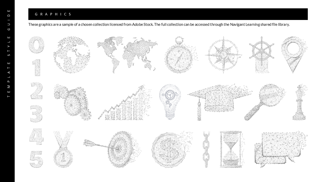
Presentation Template
Style Guide
DURATION
5 Weeks
Process
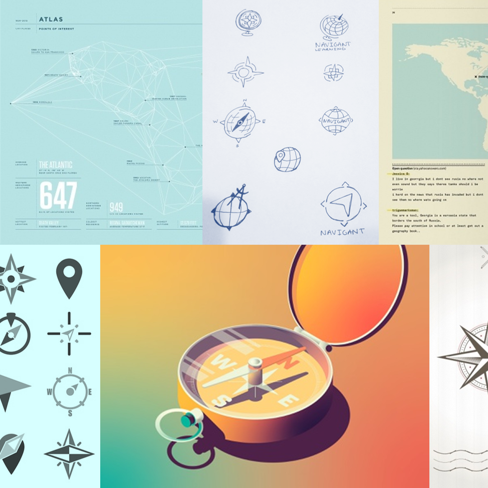
After collaboratively exploring the company's goals, challenges, and trajectory, I began the design process with mood boards and word association exercises. I soon found my footing after the client shared some sketches reminiscent of a compass rose, whose design traditionally features a faceted north star. Since stars symbolize guidance and enlightenment, and Polaris is the ultimate waypoint, this design direction seemed perfectly aligned with our messaging.
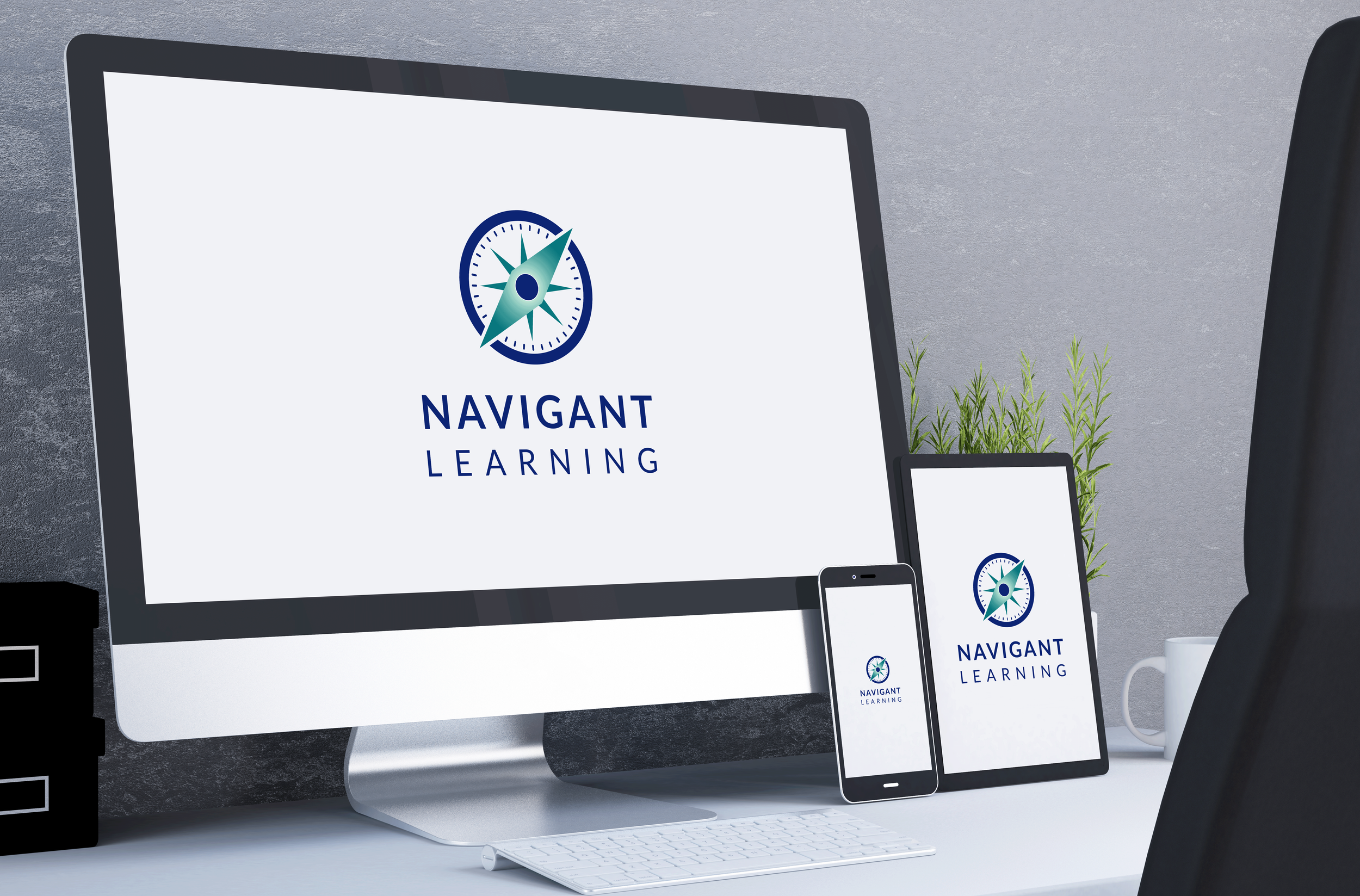
After multiple iterations, we landed on a final design that utilizes familiar symbology to inspire trust and stability. The sharp, layered angles of the eight-point star and stretched diamond needle visually coordinate with the geometry of the wordmark. Conversely, a series of concentric circles serving as the annulet, dial, and pivot (the only uninterrupted sphere) infuse the design with organic motion.
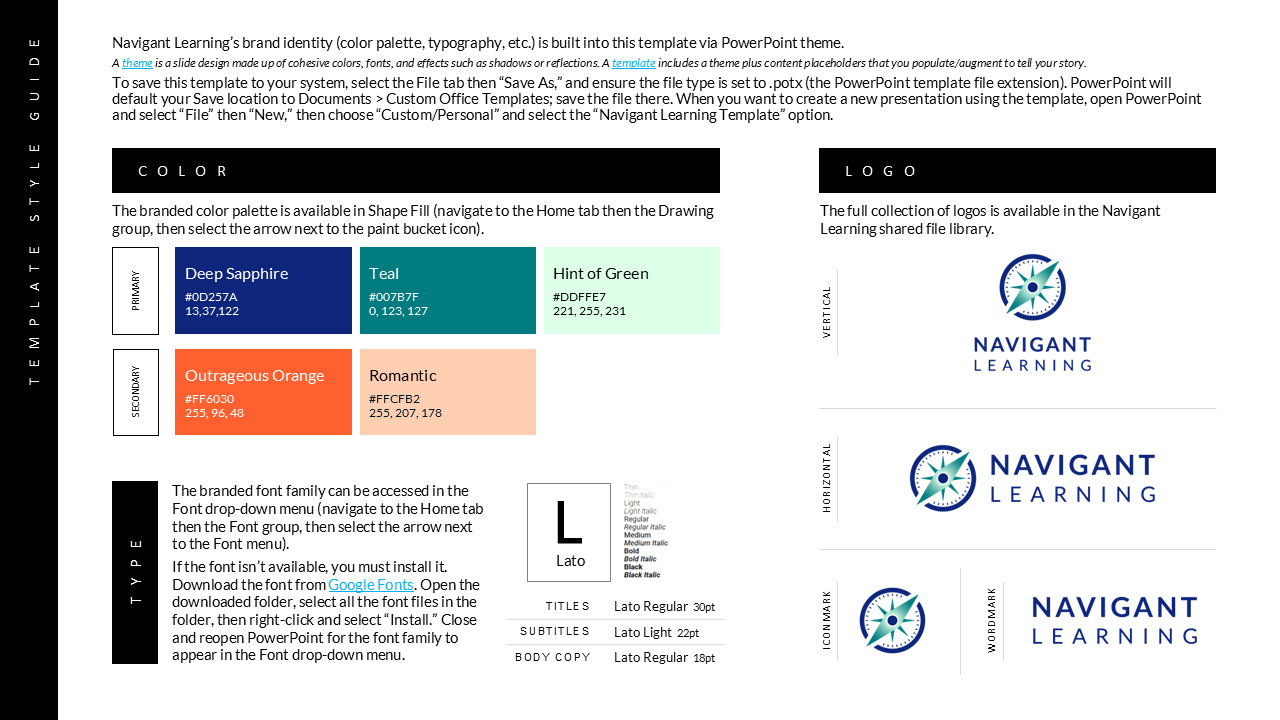
For the brand font, we opted for a clean, unambiguous typeface that would behave well across various mediums and applications.
The foundation of the brand palette consists of three analogous colors: Deep Sapphire serves as the anchor – a cold, saturated shade that evokes ocean depths and projects strength and wisdom. Teal injects vitality with an energy of renewal. Hint of Green (a light spring green) pulls you out of the deep with an effervescent, open-space feel.
Secondary colors were chosen from the opposite end of the color wheel and include a bold orange that serves as a grounded accent and a subdued peach that lends some elasticity to the palette.
Outcome
The client's desire for a brand that conveyed both guidance and integrity became the north star for this project, resulting in a cohesive visual identity that clearly communicates the company’s mission and values.
Since their official launch in 2024, Navigant Learning has strengthened its position in the L&D landscape as a trusted guide and innovative collaborator.
DELIVERABLES
Logo Suite - Designed for both print (CMYK) and web (RGB) in Adobe Illustrator, delivered in 2 orientation variations (vertical and horizontal) and 3 color variations (color, white, and black) in multiple file formats (PNG, JPG, SVG, and EPS)
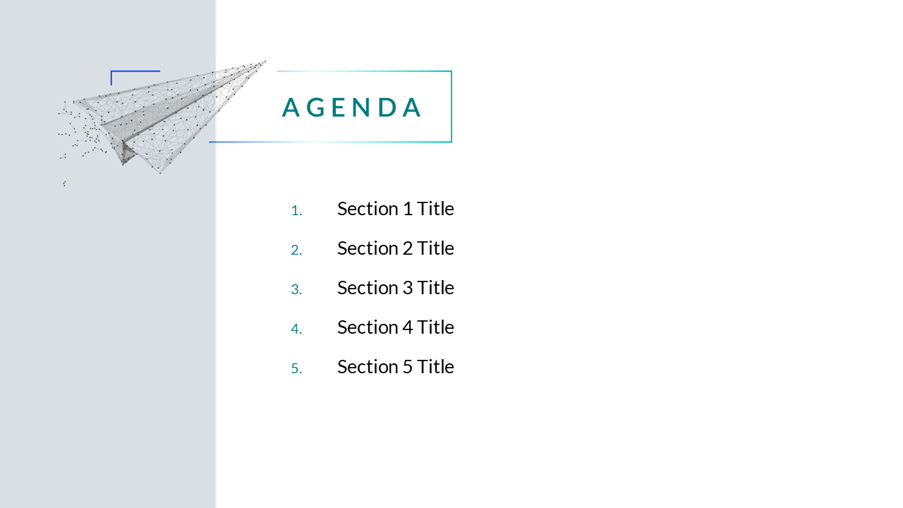
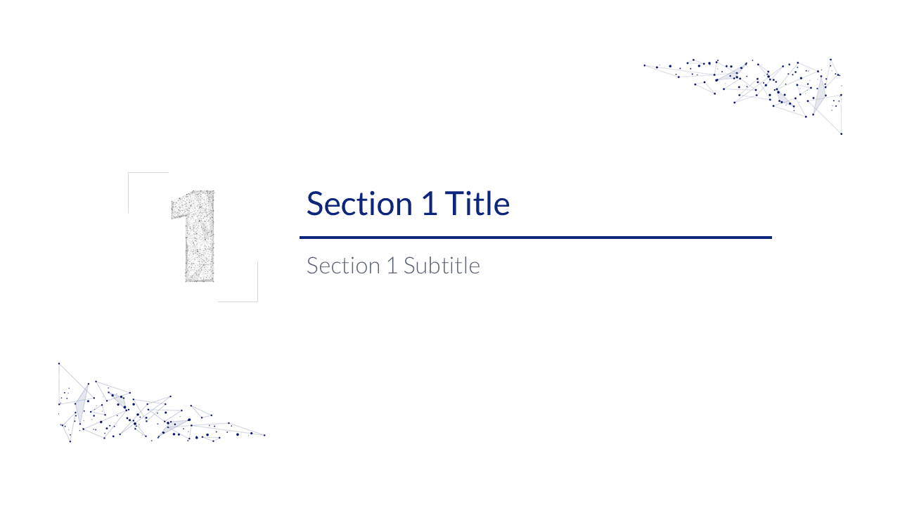
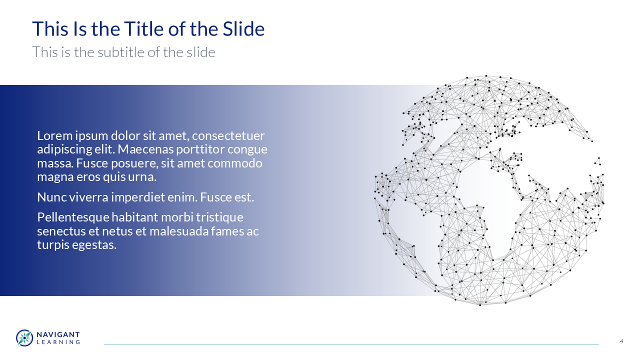
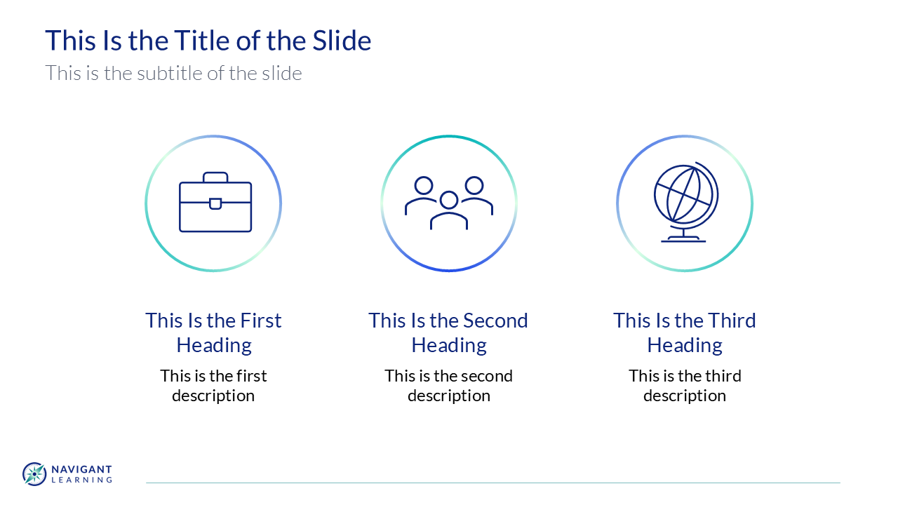
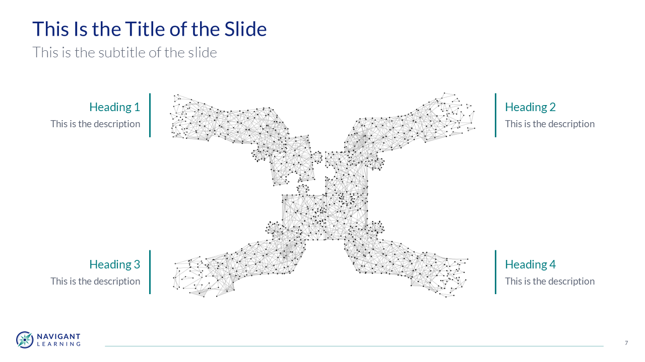
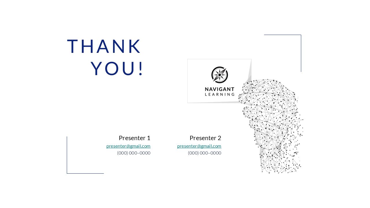
Presentation Template - 16:9 PowerPoint template of 10-15 slides with branded slide master and built-in theme (color palette and typography), comprised of core slides (title, section title, text) + 3 additional layouts with custom graphics, examples, and style guide
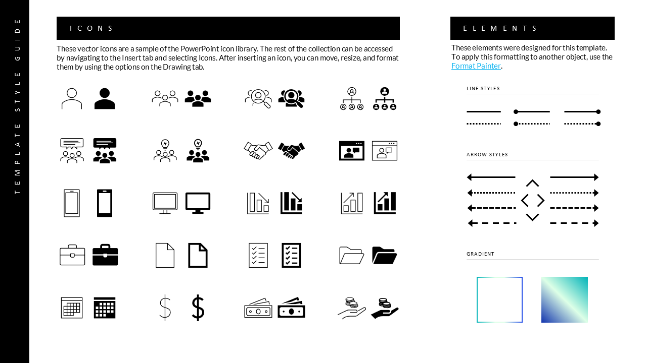
Style & User Guides
Client Feedback
Having a more formal process worked really well. Appreciate the thoroughness of what you do, taking the time to explain the thought process was valuable.
You provided a lot of feedback and guidance - a lot more than I expected - and were very communicative.
— Tarrel Pierson, Co-founder
We were extremely impressed with everything around your approach, creativity, and where we landed. The way you lay everything out is so easy to react to, way better than what we would’ve come up with.
Well done across the board, and a great experience to work with you.
— Ric Garner, Co-founder